family office
Rebranding
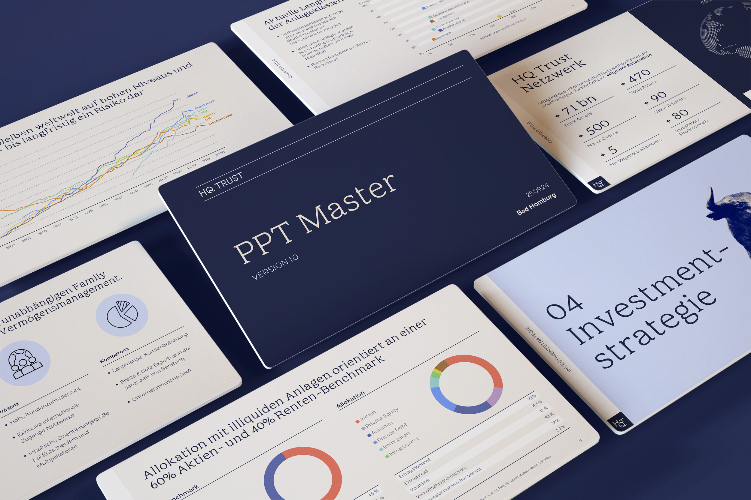
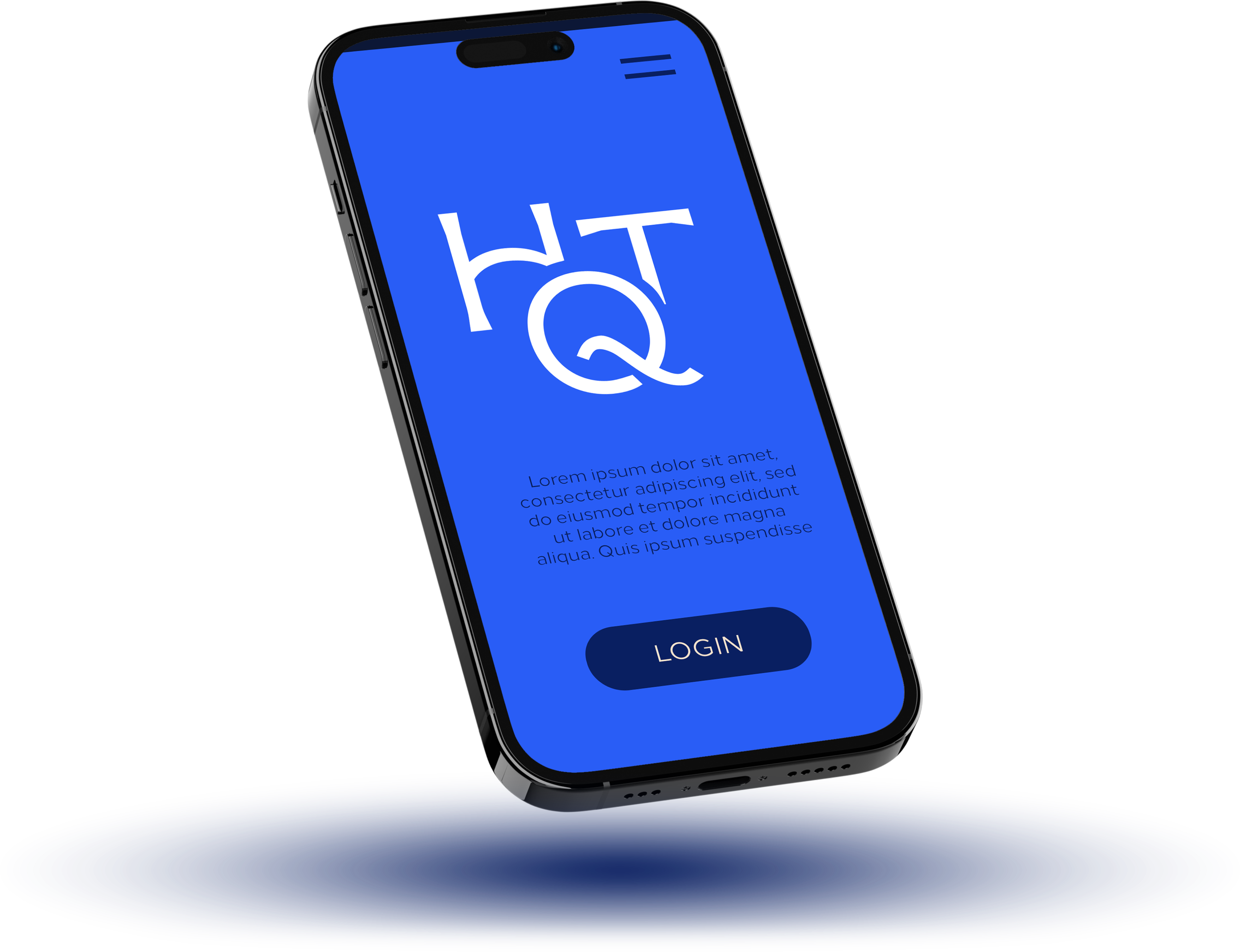
HQ Trust is the multi-family office of the Harald Quandt family and manages wealth for high-net-worth individuals, families, and foundations. The company provides independent advisory services in wealth management, family office solutions, and alternative investments. The rebranding represents the company’s independence and sovereignty. The custom type logo and brand icon convey a sense of exclusivity and value. The subtle color palette underscores the brand’s understated elegance, complemented by a modern, electrifying blue.
Color System
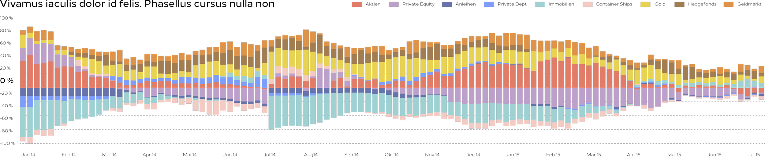
The core dark and electric blue brand colors have been extended with a full range of friendly colors that support understanding financial reporting. The colors fit into a coding system, covering any amount of asset and sub-asset classes. The refreshing look for data analytics make it easier to understand complex information and appealing to dive into vast amounts of financial reporting.

Online Branding
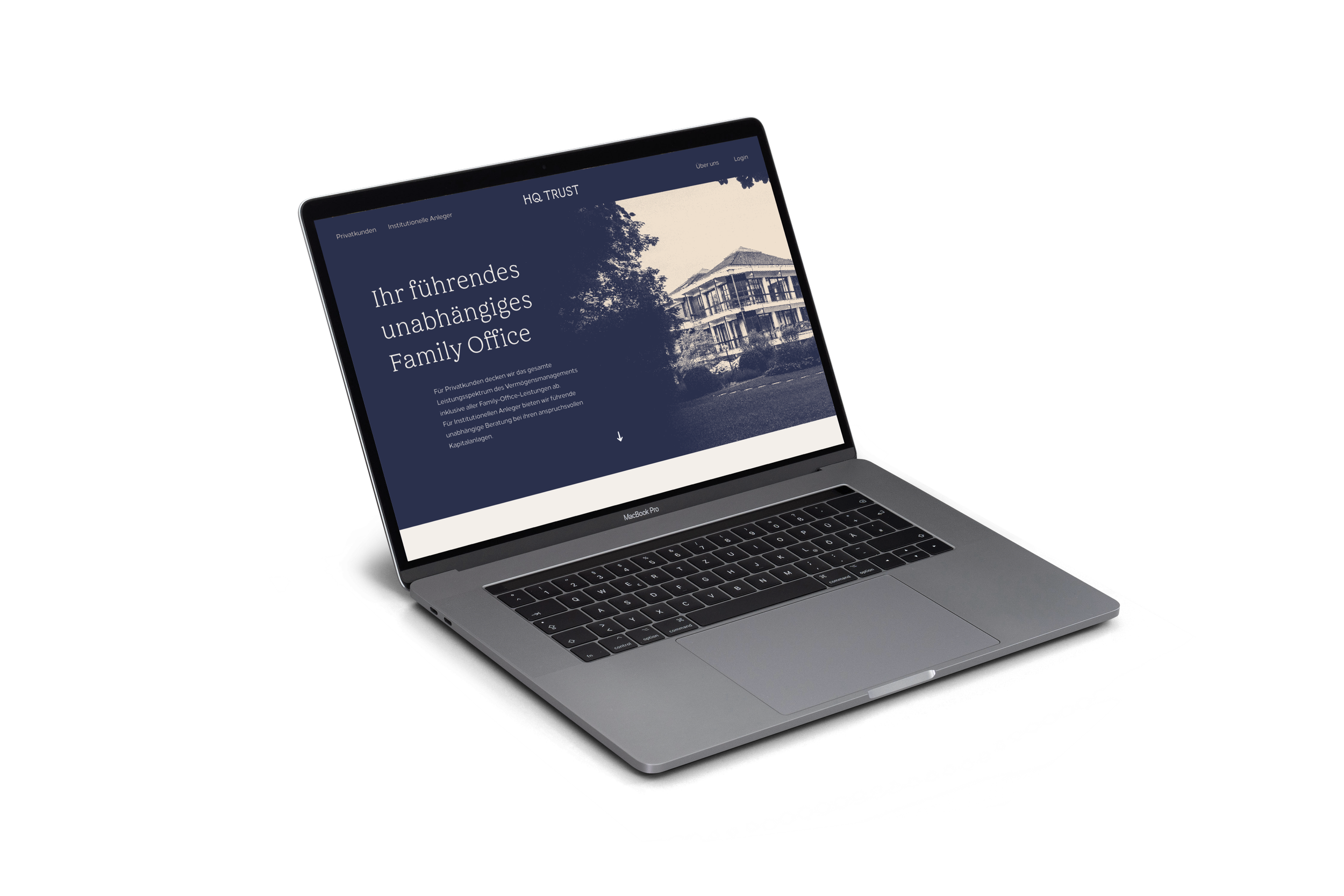
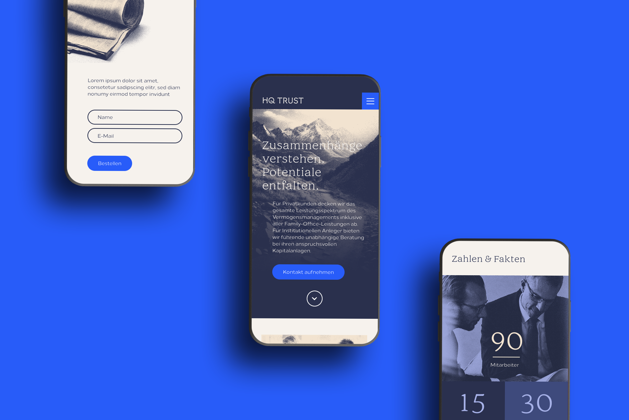
The minimalist website serves as a platform for clear communication of complex topics. A traditional serif headline font seamlessly complements the modern UX/UI elements, creating an elegant and refined browsing experience.
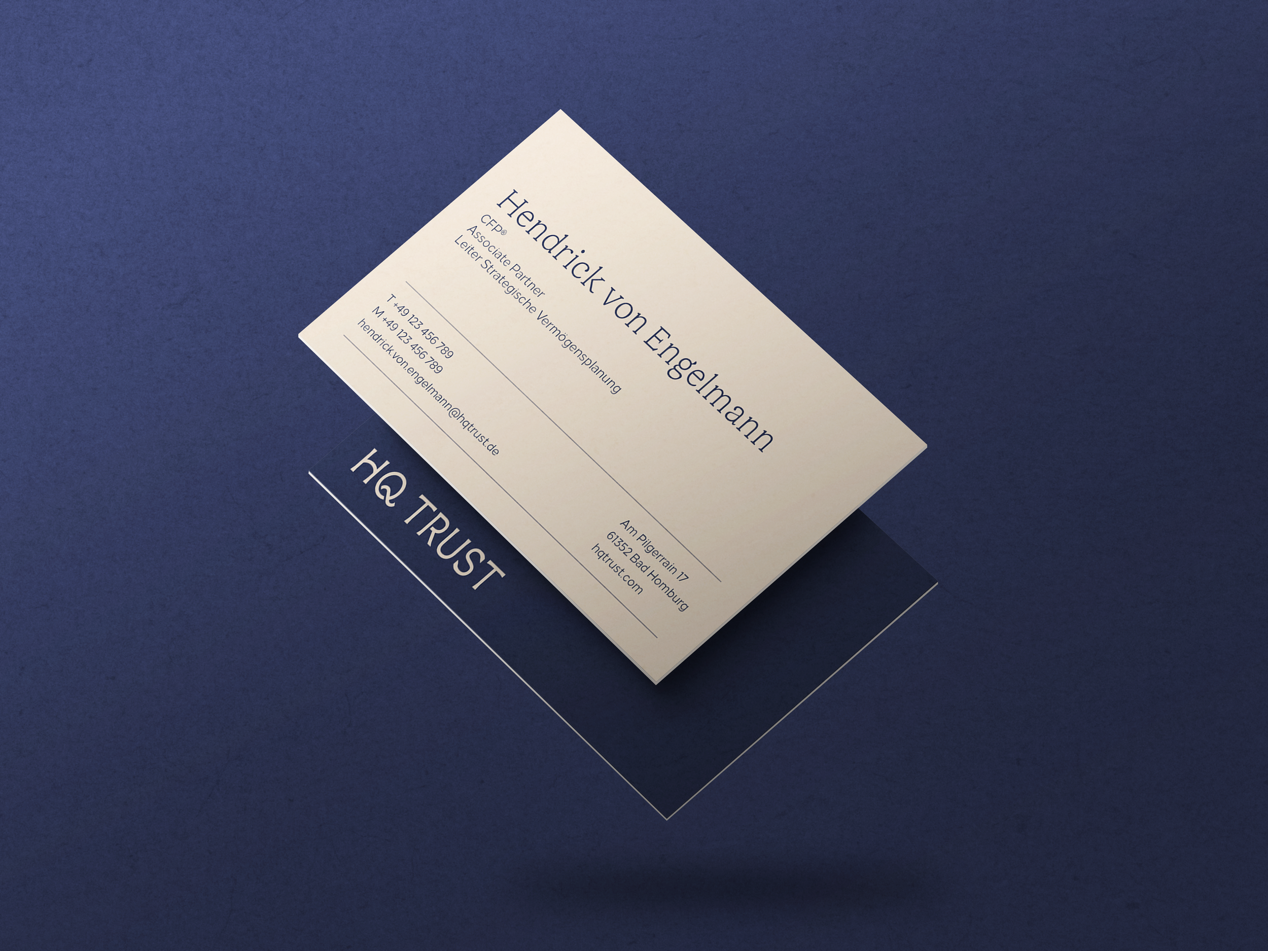
Printed Branding
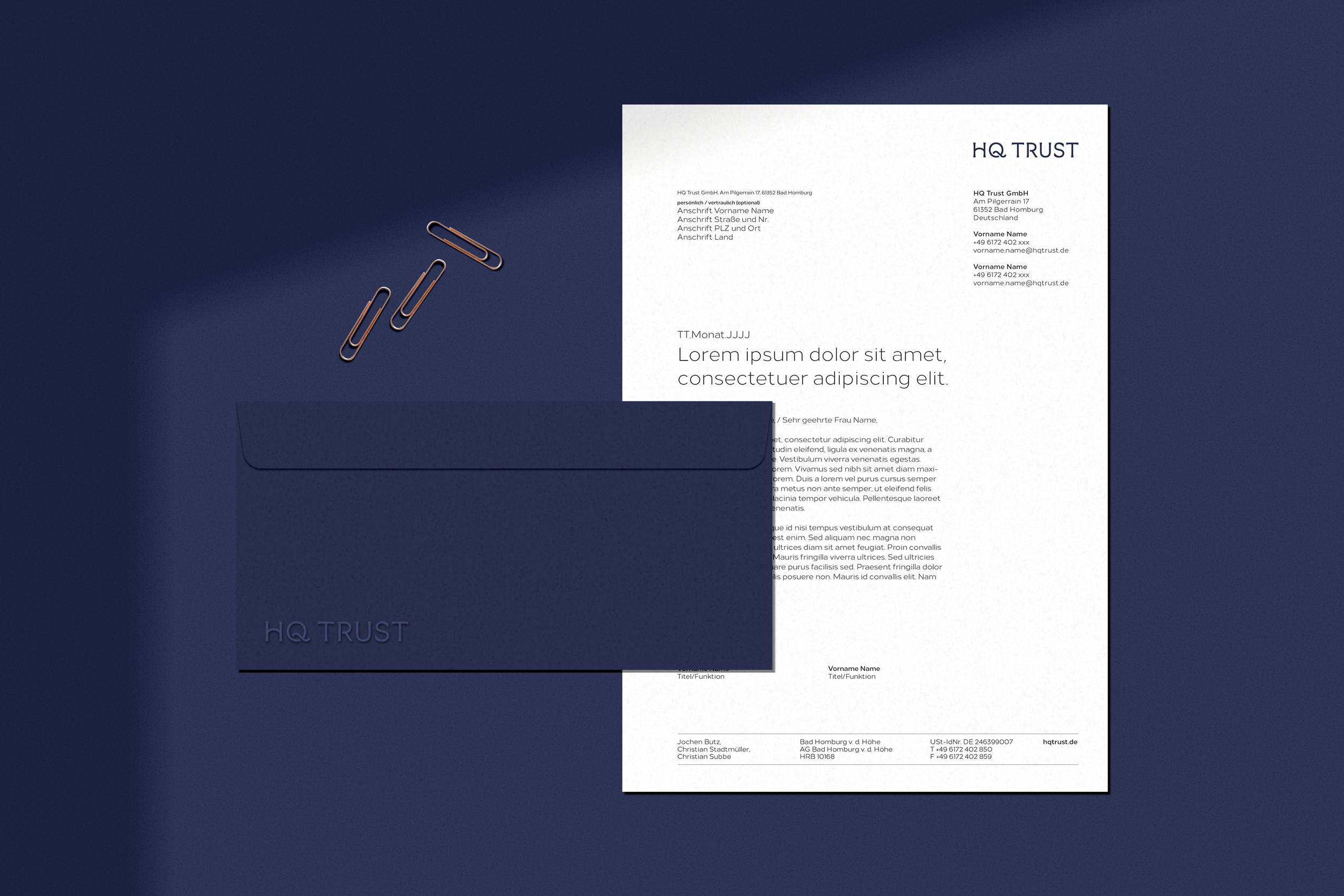
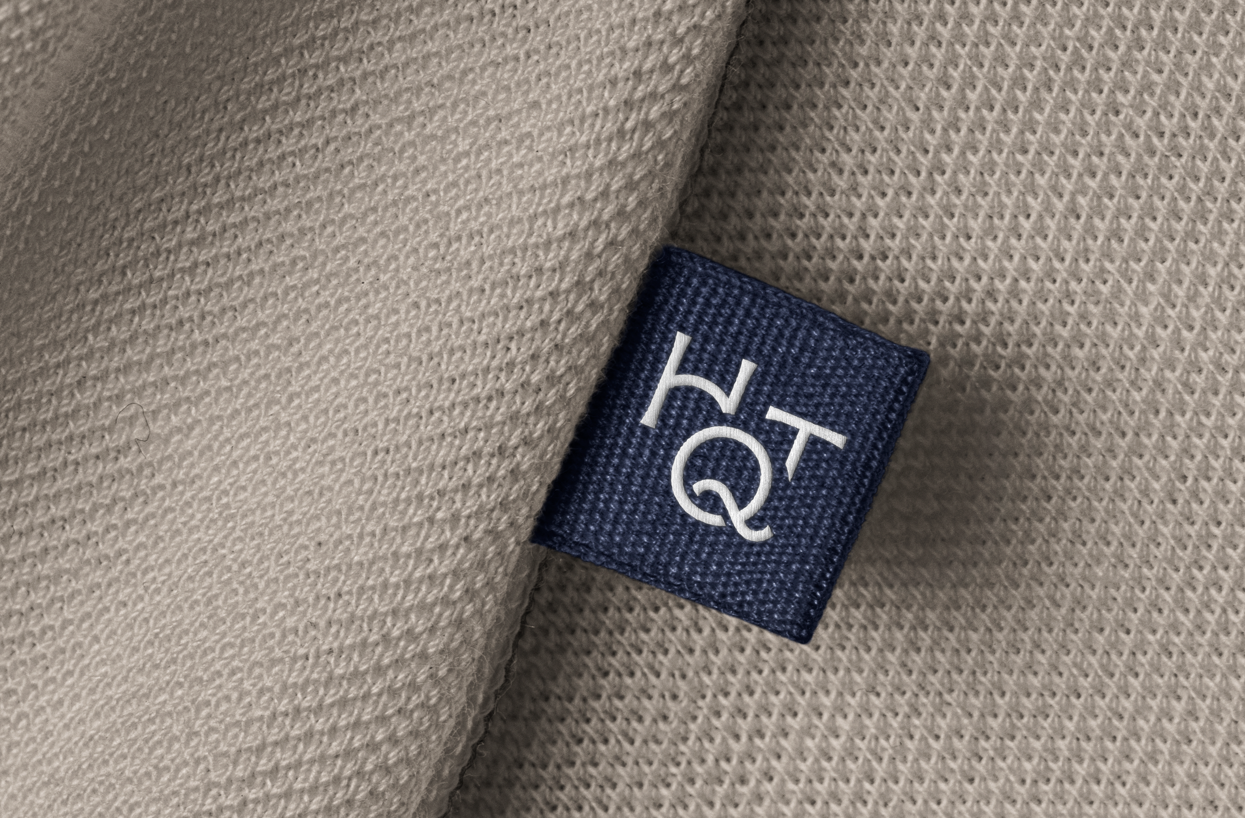
All stationery and branded items are printed on high-quality paper and materials, giving it a premium feel in the hand. The off-white shade is easy on the eyes, while the deep blue—achieved using pre-colored paper—is as rich and intense as it gets, reflecting HQ Trust’s keen eye for detail and consistant commitment to quality.